|
Summer is here and I aspire to feel a bit more zen as I am off on my holidays on the 4th of July, hence this newsletter about awakening the senses and the power of presence. I just read that learning the art of seeing can boost our productivity and sharpen our problem-solving skills. Oh how I want to believe this! So here goes;-) The Art of Seeing In a world dominated by digital distractions and constant stimuli, being present in the moment is hard. But the art of seeing begins with the simple act of being fully present so try to reduce distractions and train your mind to be more attentive. Everyday life is filled with ordinary moments that, when observed closely, reveal extraordinary beauty. The play of light and shadow, the intricate patterns in nature, and the expressions on people’s faces all hold a unique charm when seen with intention. This heightened awareness can lead to a sense of rejuvenation and increased energy. By appreciating the beauty and vitality in your surroundings, you may find that your overall well-being improves, fostering a more positive and energised mindset. The art of seeing thrives on curiosity. Cultivate a childlike wonder and approach the world with fresh eyes. Ask questions, explore the unfamiliar, and seek to understand the stories behind the things you encounter. By fostering curiosity, you unlock a treasure trove of knowledge and expand your perspective on the world. This heightened awareness can lead to innovative ideas, fresh perspectives, and a greater ability to connect seemingly unrelated concepts. By approaching challenges with a more observant and open mindset, you are better equipped to identify alternative solutions and think outside the box. The art of seeing is a a continual process of discovery and appreciation. It’s not easy to slow down. But I’m thinking this summer holiday will be a good time to try it out. So what say you? Will we have a go at this? PS: I am not back until July 27th, however Leanne will be here.  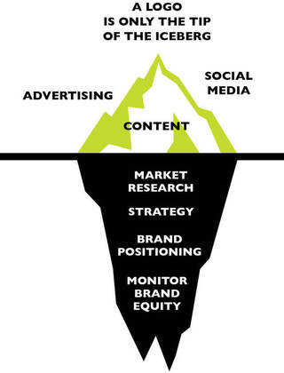 A brand is the perceived image of the product or service you sell. Branding is the strategy to create that image. In other words, brands are defined by customers. Branding is the promise you make to your customers. Make them the centrepiece of everything you do. What do people say, think, and feel about your business? The answers you get, the instant reaction someone has when your business is mentioned, that is your brand. All our daily decisions are driven by branding, from what products to use, to what services to avail of and to what organisations to get involved with. Everything from clothes and soaps to cities and charities, it’s all branded. The key to effective branding is that you must be what your brand says you are. You have to define what your business is about. A good example of a business who has managed to build consumer trust and emotional attachment is Lego. They’re not just building blocks for kids. They represent childhood imagination and creativity. An important part of branding is your visual identity. But this is only the tip of the iceberg. Branding is the strategy you put in place to form the impression people get about your business. Approach your communication by focusing on how you want your target audience to feel. You want to paint a clear picture of the exact position your brand intends to occupy in the mind of your target audience. Instead of telling them about features and benefits, you want to make an emotional connection with them. Half the challenge with building brands is getting into people’s heads and emotions help. Emotion is powerful. Positioning: Understand your market Finding out where your brand stands or where it doesn’t stand in the market, is the next step. You need to research everything there is to know about your business and the market in which it will compete. To find the correct position for your brand in order to be successful, you need to understand what people want, what you can offer, and what your competitors are offering. What problems do we solve? What makes us different? It is very important to differentiate between knowledge and assumptions. Do research by collecting the right kinds of data to conduct a fully realised diagnosis of your brand. Take time to interview decision makers. Get a group together for a brainstorming session, to define strengths, weaknesses, opportunities and threats (a SWOT analysis). Or, alternatively, work out where you are and where you could be in the future by making a list of these three things: The facts. The obstacles. The opportunities. 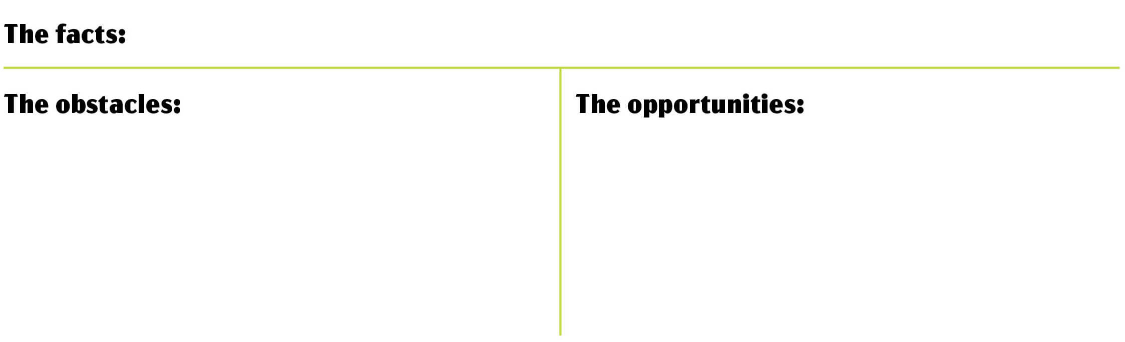 This simple structure is of great help to identify key issues. Keep it focused, just one page. Look at all the possible ways your product or service solves problems for customers, both rationally and emotionally. Make sure the benefits you single out are genuine and tangible. The aim is to find that one meaningful thing that makes your business stand out from your competitors, (the USP, the unique selling proposition or oftentimes called value proposition). And you want to make that difference obvious and attractive. A main goal when branding your business is to differentiate from the competition. It can convince a customer to purchase from you over them. Look at what other businesses are doingCreate a comparison chart to view similarities and differences of the competition, side-by-side as shown here. Choose 2 to 4 competitors and answer these questions: 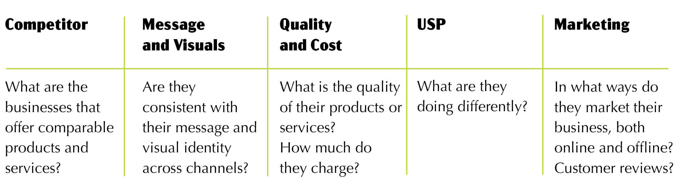 Find a gap in the market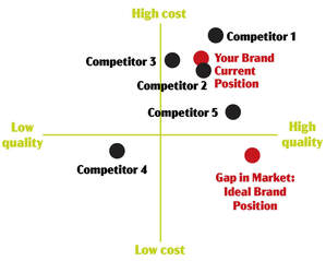 A simple way to go about this is to do a competitor brand audit, a one page map, as illustrated here. The purpose of this is to assess a brand’s strengths and weaknesses against the strengths and weaknesses of its competitors, and to identify where there might be a gap in the market. You should also have a look at other brands you aspire to. What are they doing that you admire? The most important task in building a brand is to get to know your audienceYou need to know who your customers are and how to reach them. What do they like and what do they dislike? You need to know their needs and motivators, as well as their overall profile. 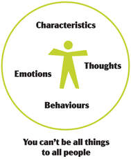 Defining your target market is critical to attracting buyers. Research both existing and prospective customers. Use surveys and/or focus groups and/or Google Analytics and/or in-person discussions to understand what your target market needs, why it is or isn’t buying from you, and what you can do to make your offering more appealing. Ask yourself what problems your product or service solves, and, in turn, to whom they appeal. Demographics such as age, gender, education level, occupation, and family situation can help you determine what your customers need and what they’re willing to spend. You should also consider who your customers are as people. What do they value? What is their lifestyle? What do they enjoy doing with their spare time? The answers to these questions can help you understand your target market on a deeper level. A buyer persona is a representation of your target customer. This is a creation of a character, with a name, job, income, interests, and responsibilities in line with your target market, with key considerations on why they need your products or service. It goes beyond basic demographics to include the intangible elements that make a person tick.  Think of your brand as a person, and create a persona for your ideal customer. Rather than describing a fiction persona try to describe a person you know instead. Or, if that doesn’t work, perhaps you can think of a famous person or a character from a film? Should this also fail, you can find a free stock photo of someone. What adjectives or words would you use to describe this persona? It’s much easier to connect with your audience when you have a specific reader in mind.
Envision that you are at a dinner party with your persona. Pay attention to how he or she behaves and talks. The most important things to nail down are your persona’s motivations and challenges, so that you can plan content that solves their issues. Put yourself in your customer persona’s shoes every time you create content for your marketing material. Use what you know to determine what channels you should be using to communicate with your persona and use his or her way of communicationg in the most natural and authentic way possible. If you are able to connect in a way that she or he believes, you will be able to create marketing campaigns that resonates. All of your customers are different so, unless you are able to give individual customers exactly what they want, you will need to have more than one customer persona. And there might be a new specific audience you wish to reach out to, whom you haven’t. Choosing who to target and who not to target is crucial. Make your brand a magnet that attracts the right customer. What your brand means to your customerYou have done a lot of research to get this far. You know what your competitors are doing, you know who your customers are and you have found a gap in the market. You know what you stand for. Now you want to write a short summary of your brand’s promise to your target audience. This summary is called a brand positioning statement and it answers the “why” you are different from the competition and the “why” customers should care. This is your chance to shine. To be truly effective, the statement should be comprised of one or two sentences that define: Your target audience: Who are they and what are their pain points? Your brand promise: How does your brand solve the problems (pain points) that your target audience has? In the eyes of your audience, what are the greatest benefits your brand offers? Your market: What is your market category? How does your brand better relate to your target audience, in comparison to your competition? Your evidence: The reason why your brand will deliver on this promise. Whatever the reason, there has to be something backing up your claim. One thing that truly helps a brand stand out among competitors is expertise. Showing a strong authority on subjects makes it easier for a customer to choose your brand. Here’s a brand positioning statement formula that might work for you: We help [target audience] Who [challenge / pain-point] To achieve/experience [key benefit] Unlike [competitive alternative] Our solution [unique point of difference] I also quite like this simple formula by Steve Blank: We help (X) do (Y) by doing (Z). I help SMEs to resonate with their target audiences by designing visual communication. Your brand proposition statement will be the greatest guide for your efforts going forward. It is a simple summary of why a customer would choose your product or service. It communicates the clearest benefit that customers receive by giving you their business. Every value proposition should speak to a customer’s challenge and make the case for your company as the problem-solver. You want to paint a clear picture of the exact position your brand intends to occupy in the mind of your target audience. Edit, revise. Be as thorough and as on-brand as possible. It is worth spending time refining your proposition statement to ensure it is saying something truly distinctive. You might also want to define your mission, vision and value statement. A mission statement lets the public know the product or service your business provides, how it does it, and who it does it for. A vision statement is a declaration of where your company wants to be in the future. It clearly articulates the hopes, dreams, and aspirations of a brand. Your values (often referred to as your company culture) let people know that you will act morally and ethically on your way to success. Your brand purpose is your North Star. Sharing what you stand for will give your brand meaning and added value. However, you want to be 100% sure that your company really wants to do things differently. You have to stay true to the promise you make. Brand managementBrands are on the world stage 24/7. All your brand touchpoints need to be branded to give the same look and feel. You want your customer’s buying process to come across as a seamless experience. Consumers don’t care about brands as much as we think they do. Pulsing brand assets through your advertising and repeating your brand assets over time are critical. You need your brand to stand out with a consistent logo, look and feel. This is how to build an association with people’s memories, so that if they shop your category, they will think of your brand. Much internal and external work goes into shaping what customers perceive. Brand management is the planning and maintenance of everything that goes into defining your brand. It is a marathon, not a sprint. Touchpoints are the point of contact or interaction between a company and its customers. Here’s a list of brand touch points that needs to be managed:
To ensure that you are educating your customers you need to evaluate each conceivable touchpoint to see what the customer will encounter. Use branding to tell a consistent story, but vary the format to adapt to the unique requirements of each touchpoint/channel. This is called omnichannel marketing. The customer journey/client experience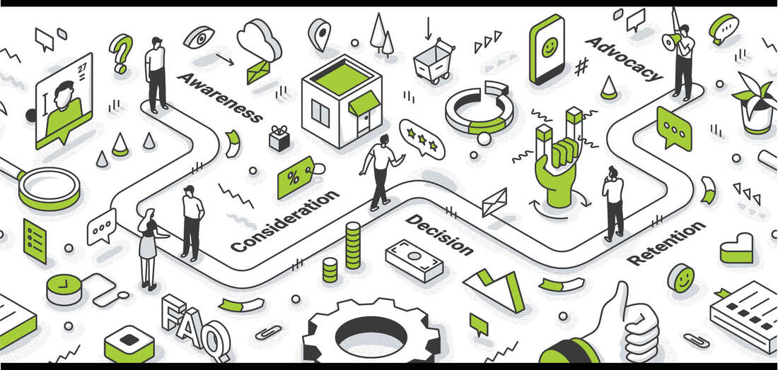 The customer journey is the decision-making process someone goes through to buy something. It is a detailed outline of every step a person takes to become a paying customer. The starting point for this process is unique to each consumer which is where a customer journey map comes in handy. Mapping out your customer journey involves looking at all the information customers need and it helps you answer important questions, like:
With the help of a customer journey map, you’ll get a better understanding of what will motivate your customers to become paying, and (if done right) loyal, customers. Shoppers are looking for magic moments. Here’s the 5 stages of the customer journey: 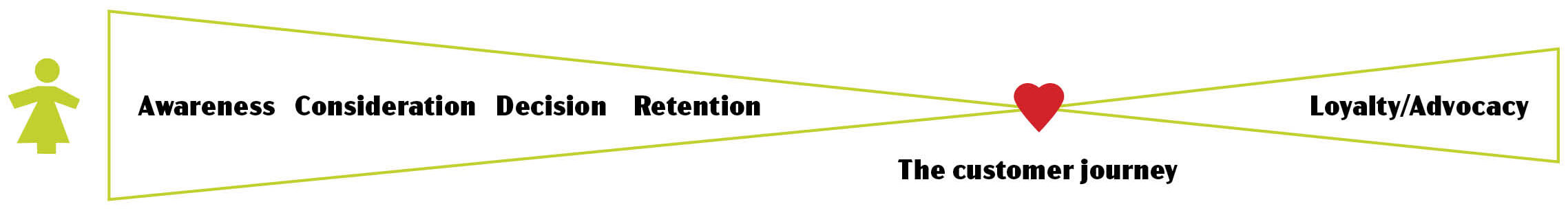 Build magic experiences for your customersAwareness At this first stage of the customer journey, customers decide they have a problem and begin to look at solutions. These prospective buyers might not know anything about you. It’s your responsibility to educate them on what you do and how you do it. The goal is to build more interest in your brand and show prospects how you can help them. Prospects in this group find your business through a variety of sources such as search engines, social media, ads or word-of-mouth. Consideration At the second stage, customers want to narrow the field to those products or services that meet their initial criteria. They look at websites, blogs and product pages to compare products and services. Decision Here they look at reviews and customer ratings and decide among their options to buy from you. At this stage it is important that you create as few barriers as possible. For example, a simple checkout process plays an important role. Or a quickly accessible information form. Retention During this stage, you want your customers to feel satisfied. This is where you provide customer support to ensure the customers that they made the right decision. Perhaps you can create a forum or a webinar or an event. Or you might email the customer with information on new products, features or benefits. Loyalty (and if done right, advocacy) The customer continues to use your brand and communicates with you regularly about its value. The aim is for your customer to become a brand advocate, by recommending your brand to others. Implementation: Get your team on board  Engaged employees are the lifeblood of every successful business. They speak positively about your company to each other, to potential employees, and to your customers. Every person who works for your business, they are all ambassadors for your brand. You want them all to be engaged, hence the importance of getting your new branding understood internally. In order for your employees to embrace the new branding, and to buy-in, they need to be taken on the branding journey so they can understand what’s expected of them. To involve staff in the process you might arrange a staff workshop. Take each agreed value and then discuss how that value effects their day-to-day lives. A brand that does this well is Starbucks. Regardless of which Starbucks you visit, anywhere in the world, your experience will seem similar. This is beacuse their employees go through a rigourous training program to insure that what they value is translated into how they behave. For the visual aspect we have the branding guidelines and workshops can be held to discuss its usage. The branding guidelines should also include a tone of voice. This captures how your brand communicates. It might sound strange, but guidelines on ‘how to speak’ is incredibly helpful as we are all different people and what comes naturally to some will likely feel not-so-natural to others. Ideally, the pictures and words work in harmony. There’s power in a great launch, to get your team exited. However, employees come and go, so it’s important to maintain on-going training. You want to make sure interested employees can always get the information they need to be more involved. You want them all to be proud to play their part, and motivated to see your business succeed. Take it to the publicThe greatest strategic idea or the worlds finest symbol will fail if it isn’t seen, heard or understood.  Putting your branding into action is vital and choosing your promotional channels is as important as the message itself. You can have a powerful brand message, but if potential customers don’t see it, it has no effect. Your brand message isn’t compelling unless the right people hear it. A combination of promotional channels create the media mix that is used to promote your brand:
Approach your communication by focusing on how your brand makes your target audience feel. Instead of telling them about features and benefits, you want to make an emotional connection with them. Decide on the right channels. Decide on where and when to promote. And get your message out on a consistent basis. Repetition reinforces recognition. Your branding is not your marketing. When your brand and your branding are brought together with strategy, purpose and creativity, that’s your marketing. Integrate the 4 Ps strategies (Product, Price, Place, Promotion) into a marketing mix to ensure you have a visible, in-demand product or service that is competitively priced and promoted to your specific target market. The aim of marketing is to know and understand the customer so well the product or service fits him and sells itself. Peter Drucker Measure your brands successIt is essential to continually monitor your brand equity so that you focus on potential business opportunities and perceived weaknesses. Measuring your brand performance should lead to targeting areas where you can improve. Attention to vulnerabilities as they arise prevents you from losing too much ground before you realise it. Measuring your brand performance includes evaluating internal brand behavior (such as employee satisfaction and positive brand engagement) and external perception (such as social mentions, positive press coverage and increases in sales). It also includes evaluating your overall business performance toward your goals. KPIs (key performance indicators) tell you if you are meeting your goals. From a brand perspective, your focus should be on:
The abundance of online data available from every channel is a blessing and a curse. If you’re set up to capture the right data, you can uncover valuable insights. If you’re not, it’s just a waste of time and effort. Decide what you need to measure and focus on your main business goals. The quickest way to devalue your brand equity is to act in ways that are counter to your values. Brand equity is built over a long time but can be destroyed in an instant. Branding is a mindset that requires a holistic approach that can’t be owned by any one department. Growing and maintaining a brand is the foundation of a business. You are not only investing in design. You are also investing in maintaining a culture. Are you using AI yet? I have been using it for a while, but only for writing stuff. The few times I've tried if for graphics it has been utterly rubbish. It's all about the quality of the prompting, though, so I guess it's on me...
I used the free version of ChatGPT for this article about marketing messages that shifts the focus from the product to the experience or emotional benefit, in order to create more engaging, and hopefully persuasive, marketing. Notice how polite I am towards a robot;-) __________________________ Me: How to dramatise a marketing message? One great example of this is: “Sell a good night’s sleep, not the mattress.” Can you come up with other examples please? ChatGPT: Dramatising a marketing message involves focusing on the benefits and emotions associated with the product rather than the product itself. This approach can make the message more compelling and relatable. Here are some examples across various industries: Travel and Hospitality: “Book a room at our hotel.” / “Escape to a sanctuary where every moment feels like a vacation.” Automotive: “Buy our new car with advanced safety features.” / “Drive with confidence, knowing your loved ones are protected.” Fitness and Health: “Join our gym with state-of-the-art equipment.” / “Transform your life and unleash your inner strength.” Technology: “Buy our smartphone with the latest features.” / “Stay connected to what matters most, effortlessly.” Food and Beverage: “Our coffee has a rich, bold flavour.” / “Start your day with a burst of energy and a smile.” Fashion: “Purchase our latest fashion collection.” / “Express your unique style and make a statement.” Education: “Enrol in our online courses.” / “Unlock your potential and embark on a journey of lifelong learning.” Home Improvement: “Get our new paint for your house.” / “Transform your living space into a vibrant haven.” Insurance: “Sign up for our comprehensive insurance plans.” / “Enjoy peace of mind knowing your future is secure.” Beauty Products: “Buy our anti-aging cream.” / “Reveal your timeless beauty and confidence.” Financial Services: “Open a savings account with us.” / “Watch your dreams grow with every deposit.” Entertainment: “Subscribe to our streaming service.” / “Dive into a world of endless adventures and unforgettable stories.” By shifting the focus from the product to the experience or emotional benefit, these dramatised messages create a more engaging and persuasive appeal to potential customers. __________________________ Endless examples provided in seconds. It really is mind blowing but you probably agree with me that most of the examples are rather poor. Nonetheless, it is a usual tool to get going. Usually I ask for amended versions, followed by a lot of editing, but I thought it might be interesting to show you a starting point, hence this quickest e-zine ever. And the prompting wasn't bad, sure it wasn't? Step into spring, with a spring in your step! The Irish are the real pros when it comes to playing with words. The author Sinead Moriarty said it so well in the Irish Times about a week ago: The Irish are able to take the language and dance with it. I have worked with some of the best copywriters in the advertising industry, so of course I should leave this to the experts. I am a visual person after all. But I just have to have a go at it for this month’s blog post. It’s pure joy out there at the moment, with all my tulips flowering. Spring is here. A well-executed pun can add a playful and memorable touch to a campaign, making it more engaging and shareable. However, it’s important to recognise that not all puns are created equal. Some can come across as cheesy and [dare I say] comparable to “dad-jokes”, so it’s crucial to ensure that the puns you use are both clever and relevant to your brand and audience. Here’s some examples below. Some real. Some not. Some good. Some really, really bad. But hopefully it makes for an enjoyable read. Kit Kat: Have a break, Have a Kit Kat. House of Fraser: Temptation on every level. Ben & Jerry’s: Lights! Caramel! Action! Krispy Kreme Doughnuts: Donut worry, be happy! Indulge in a hole lot of sweetness with our glazy, sprinkled, and filled treats that are dough-lightful. Kraft: Get your chef together. Charmin: We’re on a roll to keep you feeling comfy and confident. MailChimp: Our platform is bananas and our users go ape for it! Skittles: Taste the rainbow. Lay’s Potato Chips: We’re not just any chip off the old block – we’re the crunch that packs a punch! Duracell Batteries: Power on! Tide: You can’t be too clean. Starbucks Coffee: Espresso yourself! Wake up and smell the coffee with our brew-tiful selection of handcrafted drinks. Your daily grind just got a whole lot better. Here's a few visual ones. Two for Absolut Vodka as this is my favourite ad campaign of all time. It's been going since 1981. 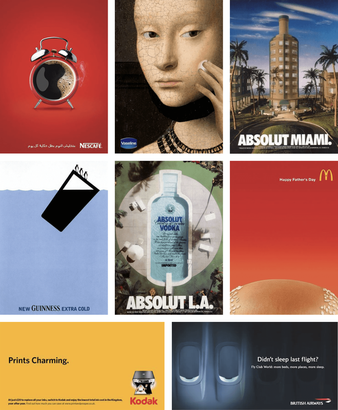 A few more....
We make scents for people who nose what they want. You butter believe it’s the best. We pour our hearts into every cup. Our bookstore is novel in every way. Our restaurant is souperb. We’re not lion when we say our burgers are the mane attraction. We give a latte love to each and every cup. Our printing services are simply inkredible. The key lies in finding the delicate balance between wit and relevance, as a well-crafted pun can elevate a marketing campaign, while a poorly executed one may leave consumers scratching their heads or, worse, turning away. We are in the midst of a ‘cancel culture’ era, after all. Ultimately, the success of puns in marketing, as with all marketing really, lies in understanding the audience, embracing creativity, and delivering a message that resonates. Inspired? Or perhaps the total opposite? I’m not so sure either... But here’s wishing you an egg-cellent Easter;-) In the intricate dance of human interaction, the words we choose can have a profound impact on the dynamics of our relationships. The simple act of replacing “sorry” with “thanks” can alter the tone of a conversation from separation to connection.
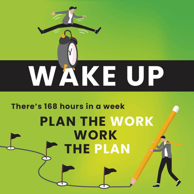
Norwegians don’t overuse the word “sorry” but after my wonderful 25 years in this country I seem to have become more Irish than most, when it comes to just that, the reflexive use of apologies. Whether it’s for a slight inconvenience or a minor misunderstanding, the default response often tends to be, “I’m sorry.” While apologies serve an essential purpose in acknowledging mistakes, they are way too often overused... Enter the concept of gratitude – a powerful, positive force that has the potential to reshape our interactions. Instead of defaulting to apologies, consider expressing thanks. For example, if you’re running late to a meeting, instead of apologising for the delay, express gratitude for the understanding and patience of others. (“Sorry, I’m late.” / “Thank you for waiting.”) This subtle shift not only diffuses tension but also reinforces a positive connection with those around you. In fact, I believe you can build bridges with the simple but wonderful word ‘thanks’. It really is an incredible way to change your mindset. And the mindset of those you are apologising to. So, the next time you catch yourself about to say “sorry,” consider the transformative power of saying “thanks” instead. It might just be the key to unlocking a new level of understanding and harmony in your interactions with others. January is over. New month, new proper beginning. Days are brighter. And it is leap year this year. We write our own autobiography each day by deciding what to focus on. If there’s things you have always wanted to do, but you never seem to find the time because there’s never any space in your calendar, well here’s an idea for you: Consider eliminating some of the things that make you feel too busy. Just because you’ve been using your time in a particular way for a long time doesn’t mean you need to keep doing that. You might start with the typical time-wasting stuff and see what can be delegated. Either to other people or to AI*. However, what I mean by eliminating things is the proper time consuming things you do, things that might or might not be of less joy or use as time has moved on. You see, in order to add some new things to your days, some stuff just gotta go! There’s 168 hours in every single week. The more clearly you know how you want to spend your days, the easier it becomes to say no to the requests that steal your hours.  So if you’re in 2024 strategy revising mode still (there’s another 11 months left after all) have a go. Because if you commit to nothing, you’ll be distracted by everything. And we all know this world is distracting enough at the moment, as it is...
Happy planning. And enjoy your bonus day on February 29th. *): Letting Artificial Intelligence do your meaningless tasks will make you do less, but better work. I read in the paper the other day that more than a quarter of the UK and US population could benefit form productivity gains provided by AI and see their workweek reduce from 40 hours to 32 hours. While maintaining their pay. I arrived in Ireland on this very day, 25 years ago, and what was meant to be a ‘gap year’ for a very ambitious art director ended up being so much more than that, and not actually a gap year at all. Arriving at the start of the ‘silly season’; it’s safe to say I got a culture shock. Us Norwegians are quite orderly, we’re punctual and we’re efficient. I’m not saying that the Irish aren’t (?!?) but come December and all sense is gone. Especially if you work in an advertising agency with access to all things involving booze for free! But it didn’t take me long to fall head over heels in love with this country. The generosity, the warmth, the fun! I couldn’t have picked a better place. So here we are, me and Ireland, celebrating our silver anniversary! With as much gusto as ever, because it’s safe to say that I have adapted the Irish ability to celebrate;-) I am mature enough now to confess to how I ended up in Ireland. It was all because of this drawing made by Terry Pattison, one of the founders of QMP Publics. I had already accepted a job offer from Italy and was just off the phone to Terry explaining as much, when I got this drawing sent to me on a telefax. 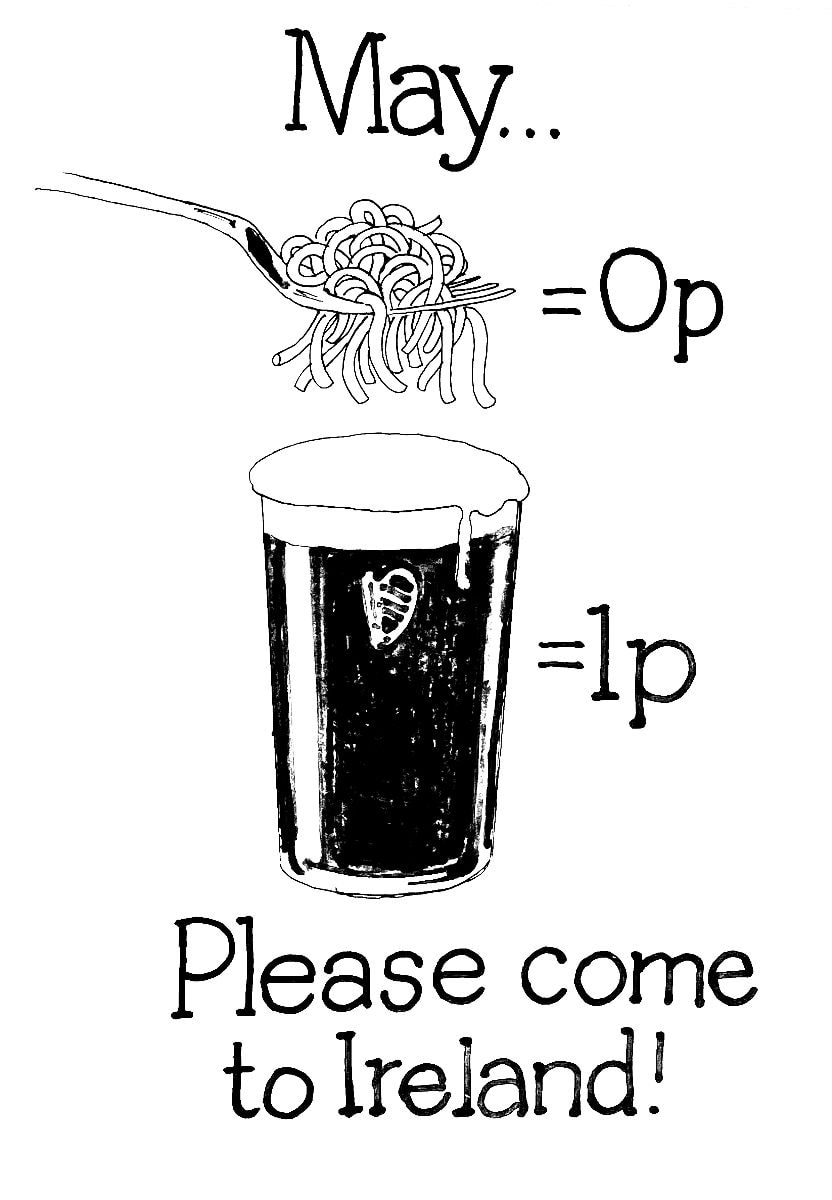 It charmed me and chuffed me so much that it made me change my mind. I call it my ‘sliding door’ moment, inspired by that film with Gwyneth Paltrow and John Hannah. Do you have a ‘sliding door’ story to share?  The bad news is that time flies. The good news is that you’re the pilot! Here’s a few selected photographs of my kids, from tiny tots to teenagers. They’re all taken in my home town Mandal, our little peace of heaven. Okay, so I’ve made Ireland my home but here’s to tons more summers in Norway. And just to say; whenever there’s a game or contest on, there’s no doubt; I want Norway to win;-)
I’m a mother of two human beings but I also feel like a mother of quite a few brand identity designs! One such ‘baby’ of mine is the Norwegian loyalty card 'trumf', which was launched in 1996. It’s hugely successful, with over 2 million members. In a small country with less than 5.5 million people, that is quite something. But as for the branding, well as you can see here, it has evolved since I left for Ireland... (My original design is the one to the left.) 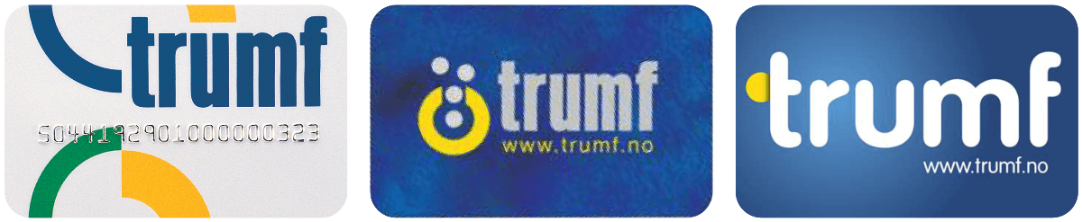 Times change, consumer interests change, culture changes, businesses change, and your brand will at some stage have to change too. Perhaps your business is looking to attract a new group of people? Expanding internationally? Or maybe your business has merged or acquired? Could it be that after many years of being in business, your brand has become too complicated? Does your branding accurately tell your brand story? A successful rebranding involves overhauling a company’s goals, message and culture. Sometimes it involves changing a name. And most often it involves changing a logo. The world’s largest operating system, Android, updated its visual identity this month to better connect the brand with Google. What Jason Fournier (director of Android Consumer Brand Management) wrote about it resonated with me: “Each time we overhaul our branding, we evaluate not only changing needs, but also future goals.” However, if you want to rebrand just because your brand identity looks old and outdated, then a subtle tweak to refresh it might be all you need. One such example is this recent work I did for the Irish Nutrition and Dietetic Institute. (My evolved design is the one to the right.) 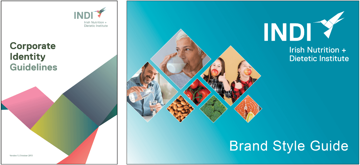 Whatever your business may need, why don’t you get in touch with me to discuss?
Colours have the power to convey and communicate meanings and messages without words. It is the most important component of a logo design and by far what people remember the most, much more so than the shape or word of the logo itself. In branding and design the use of colour is hugely important as they are signifiers for emotions which we are often unaware of. In fact, most of us, weather we are conscious of it or not, would make a snap judgment about a product, based on its colour alone. Choosing the colour (or colours) that best represents your brand is no easy task as different colours can provoke very different reactions in people. However, there’s a few things I think we can all agree on. Warm colours are associated with energy and cold colours bring calmness. Black is total absorption in complete contrast to white, which is total reflection. Red is a passionate colour as it stimulates us and raises the pulse rate. Green is the colour of balance. Blue is the colour of the mind and is essentially soothing. But then there’s light blue and dark blue and..... Not to mention the use of more than just one colour. In this blog I have created an infographic which illustrates 12 different colours and my (researched) definition of what these colours communicate. When designing a brand identity I recommend choosing two dominant colours (one main colour and one complimenting colour), along with another 2 or 3 accent colours, one of which should be a contrasting colour. 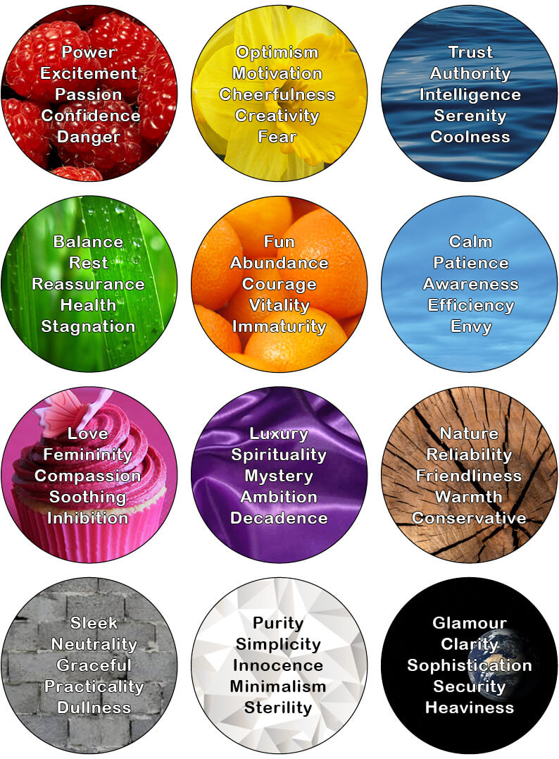 So what colour suits your business the best?
A very simple exercise that might help you find an answer to this is to write down the words that best represent your brand’s personality. What colours represent those words? You could also check your competitors to see what colours they use in their bradning, but this is more to see what not to do. In the same way as your logo and business name must represent you, your colours must be relevant, tailored to your audience and easily identified with your industry. But, as for everything regarding branding: Brands that break the rules are most often the ones that people remember. My infographic is very simplistic and chances are you didn’t find a colour match for your words. If this is the case there’s plenty of knowledge to be found online that goes more in depth. Or you could contact me. I love the psychology of colours and I would be more than happy to help you! I hope you’ve had a lovely summer, despite crazy weather wherever you were.... Here’s to re-newed energy for us all this autumn! |

- About
-
Portfolio
- Wicklows Historic Gaol
- INDI and NNA
- ONMSD
- HSE
- NU
- Dún Laoghaire-Rahdown County Council
- PacSana
- Saint John of God
- Origina
- End of Life Ireland
- Yes Dynamic
- Park Pets
- Matt Jones
- TEDx
- Naturally Cordial
- Flanagan Kerins
- HSCPA
- Wilfield
- Mandals Advokatene
- Gourmet Chef
- Dalkey Tidy Town
- Tax Advice
- Association Innovation
- 360me
- McKeon Homes
- Clinical Leadership Competency Framework
- Blue Rock Environmental
- Testimonials
- Contact
- BLOG