|
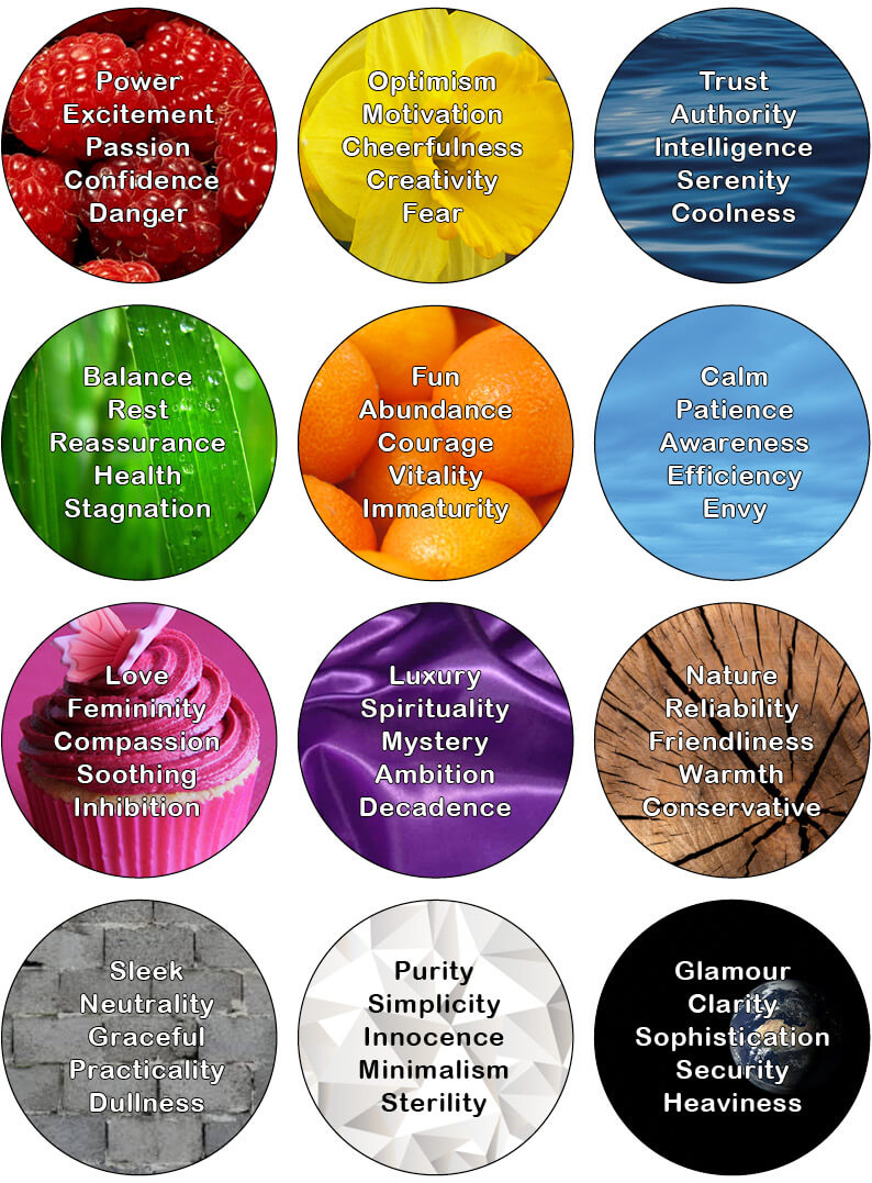
Colours have the power to convey and communicate meanings and messages without words. It is the most important component of a logo design and by far what people remember the most, much more so than the shape or word of the logo itself. In branding and design the use of colour is hugely important as they are signifiers for emotions which we are often unaware of. In fact, most of us, weather we are conscious of it or not, would make a snap judgment about a product, based on its colour alone. Choosing the colour (or colours) that best represents your brand is no easy task as different colours can provoke very different reactions in people. However, there’s a few things I think we can all agree on. Warm colours are associated with energy and cold colours bring calmness. Black is total absorption in complete contrast to white, which is total reflection. Red is a passionate colour as it stimulates us and raises the pulse rate. Green is the colour of balance. Blue is the colour of the mind and is essentially soothing. But then there’s light blue and dark blue and..... Not to mention the use of more than just one colour. In this blog I have created an infographic which illustrates 12 different colours and my (researched) definition of what these colours communicate. When designing a brand identity I recommend choosing two dominant colours (one main colour and one complimenting colour), along with another 2 or 3 accent colours, one of which should be a contrasting colour. So what colour suits your business the best?
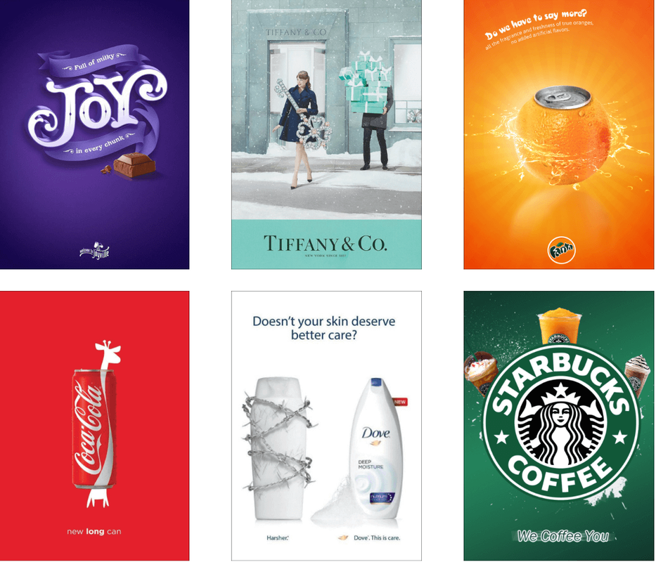
A very simple exercise that might help you find an answer to this is to write down the words that best represent your brand’s personality. What colours represent those words? You could also check your competitors to see what colours they use in their bradning, but this is more to see what not to do. In the same way as your logo and business name must represent you, your colours must be relevant, tailored to your audience and easily identified with your industry. But, as for everything regarding branding: Brands that break the rules are most often the ones that people remember. My infographic is very simplistic and chances are you didn’t find a colour match for your words. If this is the case there’s plenty of knowledge to be found online that goes more in depth. Or you could contact me. I love the psychology of colours and I would be more than happy to help you! I hope you’ve had a lovely summer, despite crazy weather wherever you were.... Here’s to re-newed energy for us all this autumn! Inspired by this clever marketing for the Barbie movie that is coming to our cinemas soon, I‘d like to share with you some other examples of brands that have taken ownership of colours. What they all have in common is this, the marketing managers are all very patient. Well, they obviously have big budgets too, but a big budget does not a successful brand make. Patience does. Most of the logos I design are for businesses with a modest budget. But regardless of how much you spend on marketing, the principle of branding is exactly the same. No matter how bored you get of your logo, colours etc, you have to stay true to your brand identity if you want others to take notice. Remember, nobody will ever see your branding as much as you do. The way these brands have taken ownership of a colour did not happen overnight. See? It's all about patience. Should you happen to work with a brand identity that simply doesn’t work, well that’s another story. No matter how patient you are, if it is not working, let’s discuss rebranding! But let’s enjoy a break this summer before we do so?
|
Browse the categories below to read about all things branding.
All
|
- About
-
Portfolio
- Wicklows Historic Gaol
- INDI and NNA
- ONMSD
- HSE
- NU
- Dún Laoghaire-Rahdown County Council
- PacSana
- Saint John of God
- Origina
- End of Life Ireland
- Yes Dynamic
- Park Pets
- Matt Jones
- TEDx
- Naturally Cordial
- Flanagan Kerins
- HSCPA
- Wilfield
- Mandals Advokatene
- Gourmet Chef
- Dalkey Tidy Town
- Tax Advice
- Association Innovation
- 360me
- McKeon Homes
- Clinical Leadership Competency Framework
- Blue Rock Environmental
- Testimonials
- Contact
- BLOG


