|
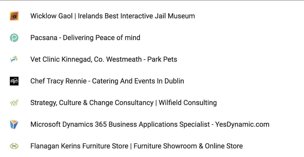
That little icon next to a website’s name in your browser tab is called a favicon. It’s short for “favorite icon” and was introduced by Internet Explorer in the late 1990s. Its purpose was, and still is, to help internet users distinguish between websites and find them quickly in their browser tabs. From a branding perspective they can also help strengthen your brand’s identity as it makes your site more memorable. I think it makes your website look more professional and more credible too. Favicons might increase the likelihood that your visitors will save your page as a bookmark. This has tons of benefits in search because Google boosts your site and improves your SEO ranking if users bookmark your page. The more user-friendly it is, the more likely it is that they will. I’m a lover of keeping things simple so usually the favicon icons I design take the form of a stripped-down version of the logo, usually by using just a symbol, as shown in these examples of favicons I have designed here. If you don't have a favicon yet, you can easily do this yourself, but if you’d like a hand with it I’m here and happy to help!
The importance of describing properly what your business is all about, in just a few words, goes without saying. I hope! Even though users can change this description themselves (as I sometimes do), I think we all prefer not to... |
Browse the categories below to read about all things branding.
All
|
- About
-
Portfolio
- Wicklows Historic Gaol
- INDI and NNA
- ONMSD
- HSE
- NU
- Dún Laoghaire-Rahdown County Council
- PacSana
- Saint John of God
- Origina
- End of Life Ireland
- Yes Dynamic
- Park Pets
- Matt Jones
- TEDx
- Naturally Cordial
- Flanagan Kerins
- HSCPA
- Wilfield
- Mandals Advokatene
- Gourmet Chef
- Dalkey Tidy Town
- Tax Advice
- Association Innovation
- 360me
- McKeon Homes
- Clinical Leadership Competency Framework
- Blue Rock Environmental
- Testimonials
- Contact
- BLOG

