|
Inspired by this clever marketing for the Barbie movie that is coming to our cinemas soon, I‘d like to share with you some other examples of brands that have taken ownership of colours.  What they all have in common is this, the marketing managers are all very patient. Well, they obviously have big budgets too, but a big budget does not a successful brand make. Patience does. Most of the logos I design are for businesses with a modest budget. But regardless of how much you spend on marketing, the principle of branding is exactly the same. No matter how bored you get of your logo, colours etc, you have to stay true to your brand identity if you want others to take notice. Remember, nobody will ever see your branding as much as you do. The way these brands have taken ownership of a colour did not happen overnight. See? It's all about patience. 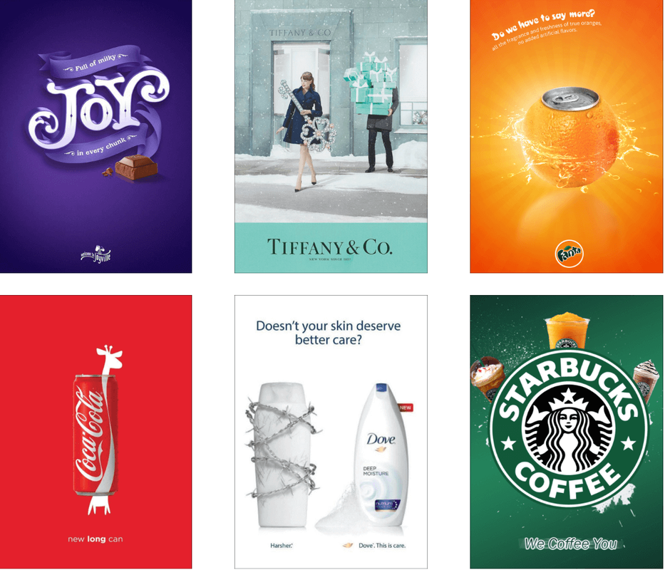 Should you happen to work with a brand identity that simply doesn’t work, well that’s another story. No matter how patient you are, if it is not working, let’s discuss rebranding! But let’s enjoy a break this summer before we do so?
I went to see a Graduate Show last week, for students who have spent 3 years studying Visual Communication. It’s the same course that I did many moons ago. Well, the concept for the course is the same. It’s about visual communication. But the work looks totally different. What I learnt about logo designs way back then.... well it’s safe to say things have evolved. The number of media platforms consumed by people has increased so dramatically, it’s hard to imagine a life when marketing could only reach you via press ads, a couple of TV channels and outdoor posters. These days you’re bombarded with marketing from search to social media, streaming channels, influencers, blogs, gaming, e-commerce, on top of all the existing ‘traditional media’. We see ads everywhere we go, even at the beach. Here's hoping only skin cancer awareness campaigns will be allowed this... 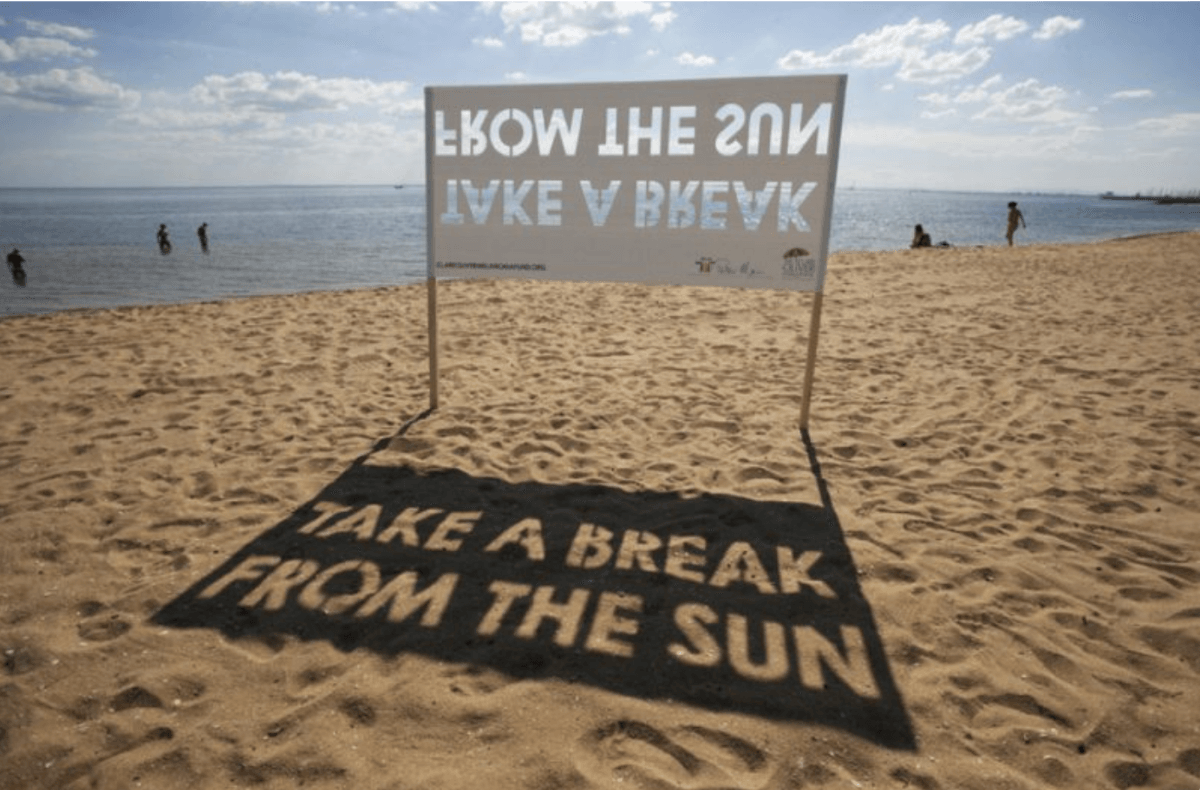 Not only is the media far more complex, our attention span is less than it was back then too if you believe the researchers at the Technical University of Denmark. Their study suggests the collective global attention span is narrowing due to the amount of information that is presented to the public. People now have more things to focus on, but often focus on things for short periods of time. Hence the importance of simplified logo designs. 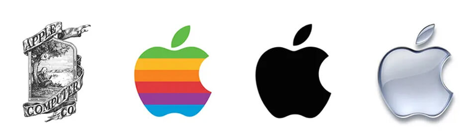 One reason for simplifying a logo is to make it more timeless and versatile. A logo that is too complex or trendy can quickly become dated and need to be redesigned. By making the logo more simple and clean, it ensures that it will remain relevant and recognisable for years to come. 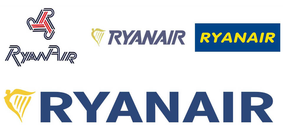 Another reason for simplifying a logo is to make it more memorable and recognisable. A simple logo is easier to reproduce and can be more easily scaled to different sizes and used across different mediums. This is especially important for global brands who operates in many countries and markets, such as Apple, Ryanair, Ikea. Their logos are great examples of logos that have evolved to stay relevant. 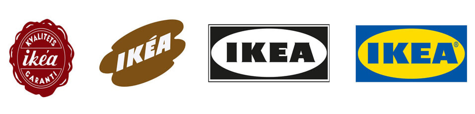 And they will continue to do so, I'm sure, in response to new trends and new technologies. There might also be a greater emphasis on sustainability and ethical branding going forward. And perhaps empathy? With the excitement but also slight fear of AI, who knows what will happen. Empathy seems to be one of the few qualities that AI can not master...
That little icon next to a website’s name in your browser tab is called a favicon. It’s short for “favorite icon” and was introduced by Internet Explorer in the late 1990s. Its purpose was, and still is, to help internet users distinguish between websites and find them quickly in their browser tabs. From a branding perspective they can also help strengthen your brand’s identity as it makes your site more memorable. I think it makes your website look more professional and more credible too. Favicons might increase the likelihood that your visitors will save your page as a bookmark. This has tons of benefits in search because Google boosts your site and improves your SEO ranking if users bookmark your page. The more user-friendly it is, the more likely it is that they will. I’m a lover of keeping things simple so usually the favicon icons I design take the form of a stripped-down version of the logo, usually by using just a symbol, as shown in these examples of favicons I have designed here. 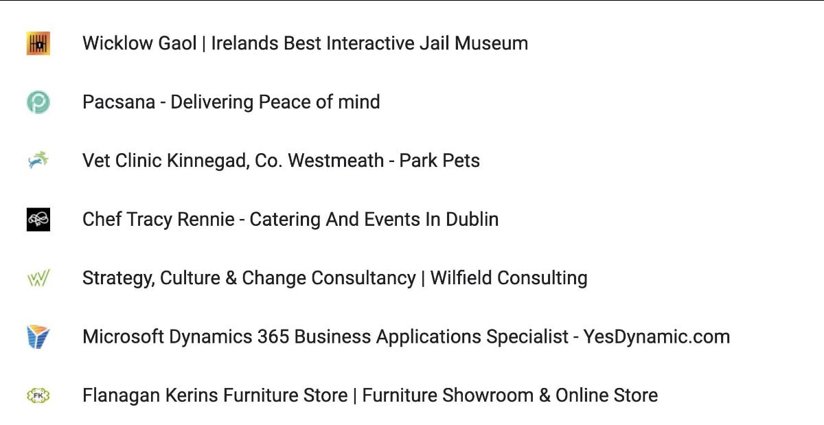 If you don't have a favicon yet, you can easily do this yourself, but if you’d like a hand with it I’m here and happy to help!
The importance of describing properly what your business is all about, in just a few words, goes without saying. I hope! Even though users can change this description themselves (as I sometimes do), I think we all prefer not to...
A number of well-known leaders such as Elon Musk (Tesla and Twitter) and Steve Wozniak (Apple) have signed an open letter published by the nonprofit Future of Life Institute, calling on AI labs around the world to pause development of large-scale AI systems, citing fears over the "profound risks to society and humanity" they claim this software poses.
The beautiful photograph is by German artist Boris Eldagsen and he won a Sony world photography award for it. However he is declining the award and says the photograph was designed to provoke debate. Well he got my vote. About the debate. What are your thoughts on this? Have you ever wondered why some people are more persuasive than others? Why some people can get others to do what they want, while others struggle to get their message across? I think it is because they know the secret to persuasive communication. They know the power of the word “because.” When we hear the word “because,” our brains expect to hear a reason, and we are more likely to comply with the request or a directive as a result. This is because our brains are wired to seek out justifications for actions. So whether you’re asking for a favor, making a request, or trying to persuade someone to see things your way, use the word “because”. It can make a big difference! Here’s some old research from Harvard (conducted by Ellen Langer in 1978) to back me up: www.psychologytoday.com  The Norwegian artist Ottar Helge Johannessen turned me into a type nerd! His passion for various typefaces and what they communicate has stayed with me ever since he taught me art when I was 18 years old. This post is about fonts and typefaces but before I get going, as it's St. Patrick's Day tomorrow, I'd like to share the Winner of the 2023 Oscar for Best Live-Action Short Film. Because it is beautiful. And Irish. An Irish Goodbye is a black comedy about the reunion of estranged brothers Turlough and Lorcan following the untimely death of their mother. Written and Directed by Tom Berkeley and Ross White. I hope you'll click the link and find twenty minutes to enjoy it! Now...... The use of fonts and typefaces in logo design is an important aspect of creating a brand identity. It helps to communicate what the business is about. Different fonts and typefaces can evoke various emotions, convey different messages and can ultimately impact how people perceive a brand. A typeface is defined by a particular set of characteristics. Most modern typefaces fall under one of two categories: Serif or Sans-serif. Rules are meant to be broken and that goes for typography as well. However, when working with visual communications, the psychology of ‘Serif versus Sans-serif’ has to be considered. It just does. Serif typefaces, with its small lines or flourishes, are commonly used in traditional and conservative industries such as law and finance. They convey a sense of formality and authority. For example, the logo for the Irish Times uses a serif font, which reinforces the publication’s long-standing reputation for serious journalism. Sans-serif typefaces are clean and has simple lines, these typefaces set a contemporary tone. It is a popular choice for companies in the tech and finance industries. One example of a company that uses a sans-serif (Helvetica) in its logo is Microsoft. Then there’s handwritten typefaces, script typefaces, decorative typefaces, etc, etc, etc, not to mention all kind of variations of the typeface, such as bold, light and italic. This is the definition of a font; it’s a size and weight within the typeface style. Despite having worked on some big-budget branding projects, I have never had the chance to develop a custom made typeface for a brand. But others have. The Airbnb logo is a perfect example. Their font is called “Cereal.” It’s playful, modern, and it reflects the company’s core values of community, inclusivity, and creativity. If you have [another] 14 minutes to spare (or less if you watch at faster speed), check out this TED Talk. It’s called ‘How a typeface helped launch Apollo’. It's a fun-facted history of typography, where designer Douglas Thomas shares Futura’s role in launching the Apollo 11 spacecraft. And how it became one of the most used fonts in the world. Happy St. Patrick's Day all! I asked ChatDPT to write an article about symbols and the meaning of symbols. And visual communication. Blimey. It took less than a minute for it to do so. I also got DALL-E 2 to generate a visual to go with it. I guess my brief was rubbish because the 3 results I got certainly were. Thankfully! I am in a bit of a shock though. That I got a computer to write my e-zine. In seconds! Might be my age but I am slightly horrified by this. But also exited! Surely this is as big a deal as introducing us to the world wide web and smartphones? But then again, I guess portrait painters were frightened when the camera was invented? And we still have the radio going strong despite the telly, YouTube and podcasts... Well here goes. Here’s the article that took less time for ChatDPT to write than it took for me to read it!
Symbols and the Meaning of Symbols: Visual Communication
Symbols are a fundamental part of human communication, serving as a visual representation of ideas, emotions, and concepts. From ancient cave paintings to modern-day logos, symbols have been used to convey messages and connect people across cultures, languages, and time. In this article, we will explore the meaning of symbols and their role in visual communication. The Power of Visual Communication Visual communication is a powerful tool that has the ability to convey complex ideas and emotions in a single image. Unlike written or spoken language, visual communication relies on the use of symbols, colors, and images to communicate messages. This form of communication is especially useful when the message is culturally or linguistically diverse. Symbols as Universal Language One of the greatest strengths of visual communication is the use of symbols, which can be understood regardless of language or cultural background. For example, the red cross is a universal symbol for medical aid, and the green and yellow circles on a traffic light represent “go” and “stop” respectively. These symbols are instantly recognizable and can be understood by people from all over the world, making visual communication a universal language. The Importance of Context It’s important to note that the meaning of symbols can change depending on the context in which they are used. For example, a red cross may represent medical aid in one context, but it may represent a pirate flag in another. Therefore, it’s crucial to consider the context in which a symbol is used when interpreting its meaning. Symbols as Cultural Signifiers In addition to their universal meanings, symbols can also have cultural significance. For example, the eagle is a symbol of freedom and strength in the United States, while the dragon is a symbol of power and prosperity in Chinese culture. These cultural symbols reflect the values, beliefs, and traditions of a particular society and can play an important role in shaping cultural identity. The Evolution of Symbols Symbols are not static, and their meanings can change over time. For example, the swastika was once a symbol of good fortune and peace in Hindu and Buddhist cultures, but it has since become associated with the Nazi regime in Germany. The meanings of symbols are constantly evolving, reflecting the changing values and beliefs of societies. Conclusion In conclusion, symbols are an essential part of visual communication, serving as a universal language that can convey complex ideas and emotions in a single image. From universal symbols to cultural signifiers, symbols play a crucial role in shaping our understanding of the world around us. Whether they are used to convey a simple message or to reflect the values and beliefs of a particular culture, symbols are a powerful tool in the visual communication of ideas and emotions. _______________ Well, what do you think? Did ChatDPT impress you too? The above image to the left was designed by DALL-E 2 and the one to the right was designed by me. It doesn't look like I have to worry about my profession just yet. Or maybe I do?  Before my job as a brand identity designer begins I need to get all relevant information about your business. We need to establish a clear objective and the best way to go about this is to write a Creative Brief. This is a communication tool that outlines a project’s requirements, expectations and resources. It helps ensure that everyone involved in a project are on the same page. To make writing this brief easier, here's a questionnaire: Information about your business/service/product
USP
Objective A straightforward plan is required to know what you hope to do and how you plan on doing it. Why do you need our help? How will you measure success?
Target audience Mindset that unites the complete target audience. If possible, try to describe a person you know.
Competitors and business challenges Understanding what the competition can offer will provide a clearer picture of where your product or service stands in the market.
Tone of voice and Brand personality Communicating with a consistent tone of voice can build trust, authority and likability. It adds an extra dimension of personality to your communications and helps to embody your brand’s values.
Vision and Brand ambition
Mission
If we were to sum all this up in a Tagline
How does your brand’s image fall between these opposing characteristics?
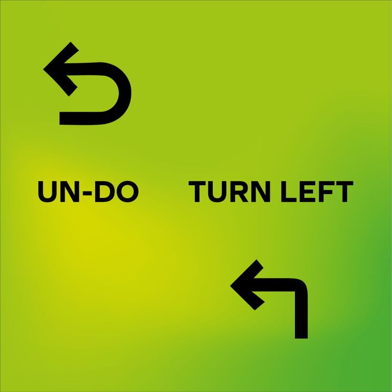
What colors represent your brand? What words would you use to describe your brand’s image? What attributes and/or emotions do you want associated with your brand.... .... and what attributes and/or emotions would you NOT want associated with your brand? Brands are mostly about storytelling. Do you have a brand? If so: What’s the story of your brand? Budget A ballpark idea of budget sets the parameters for how much time we have to work with. Are other resources required? Schedule This schedule should include design presentations, client feedback, content delivery and approval dates. Practical considerations and additional information List all elements that need to be included. Are there restrictions of any kind, like certain colours that can’t be used etc? I know, there's quite a lot of questions here.... See how you go and contact me if you'd like some help with it. I listen. I learn. I question. And when we have agreed this creative brief, then I create. The more work we put into this part of the project, the more likely we are to get it right! Let's get started! Here's to creating a brand for your business that captures your customer's attention.    How did this happen? We’re almost at the end of September and I haven’t written a blog post in ages... Sure there’s been a lot going on but that’s normal, so why has it taken me until now to sit down and write and what’s worse; no topic comes to mind! What, what, what to write about with all the noise already out there? Hmmmmmmm, okay, do you know about the magic that is TK? TK is a great tool for writers. It’s an editing mark that stands for 'to come' and it indicates that information will be inserted later. It lets you sustain your momentum while writing. You’re in the flow and the last think you want is to waste time adding details. That’s work for a 'slow day'. The purpose of TK is that there is only one or two proper words in the English language that contain these two letters juxtaposed in this way, making it easy to search your written work in order to fill the missing gaps before you share your work. Ever since I started using computers I have loved the ‘undo’ button. And there’s been plenty of times I wished I could use this ‘undo’ in real life too. Well I can’t. Nor can you. But at least there’s TK. “Do not stop and wait for everything to be perfect before you proceed.” That is the magic of TK. And that’s how I ended up posting this! 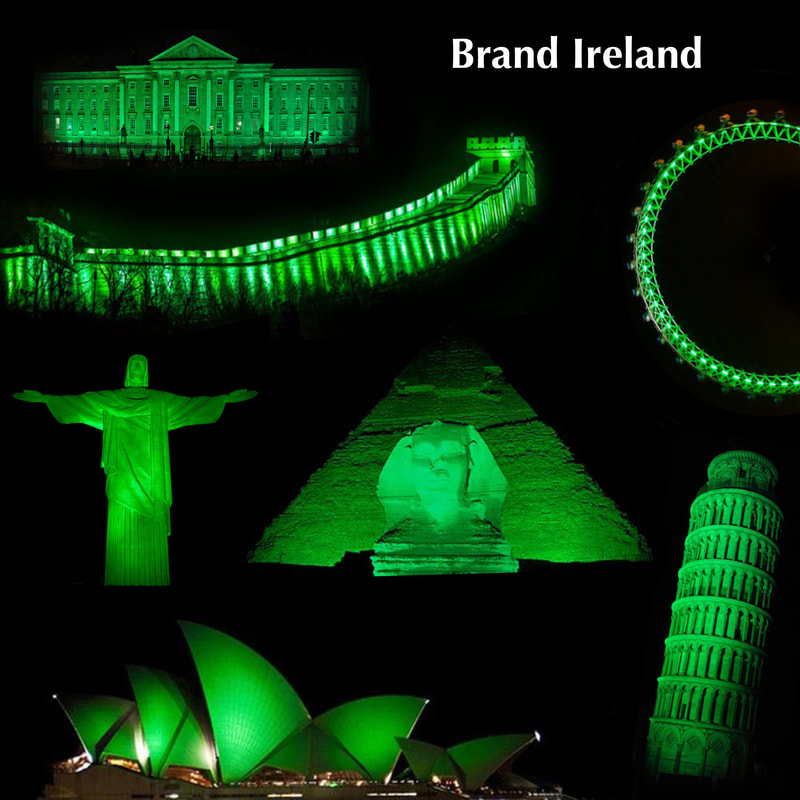 The Global Greening began in 2010 when the Sydney Opera House and the Sky Tower in Auckland went green. Last year almost 700 iconic landmarks in over 60 countries partook. This year, I hope to see all these buildings in blue and yellow instead.
I do not in any way mean to be flippant about this but as words do not seem to register with Putin, perhaps if he got a glimpse of the whole wide world in the Ukrainian (украї́нська мо́ва) colours, there could be some hope? Naive I might be.... but here’s the biggest BEST OF LUCK to all involved with making this happen! Brand Ireland More than 70 million people around the world claim links to Ireland but St. Patrick himself wasn’t even Irish! He was thought to have come from either Wales or Scotland, where he was abducted at the age of 16 and brought to Northern Ireland as a slave to herd sheep. But as he escaped, he had a vision and returned to Ireland to spread the word of Christianity. He remained in Ireland for the rest of his life, preaching, baptising and building churches. Thanks to an Irish Franciscan friar from Waterford named Luke Wadding (born in 1558) who invented St. Patrick’s Day we now celebrate St. Patrick’s Day to mark St. Patrick’s death (in 461 in County Down). Celebrating? It’s not easy to get into a festivities mode at the moment but browsing this site might help? https://stpatricksfestival.ie Whatever you get up to...... Here’s wishing you all a very good St. Patrick’s Day. |
- About
-
Portfolio
- Wicklows Historic Gaol
- INDI and NNA
- ONMSD
- HSE
- NU
- Dún Laoghaire-Rahdown County Council
- PacSana
- Saint John of God
- Origina
- End of Life Ireland
- Yes Dynamic
- Park Pets
- Matt Jones
- TEDx
- Naturally Cordial
- Flanagan Kerins
- HSCPA
- Wilfield
- Mandals Advokatene
- Gourmet Chef
- Dalkey Tidy Town
- Tax Advice
- Association Innovation
- 360me
- McKeon Homes
- Clinical Leadership Competency Framework
- Blue Rock Environmental
- Testimonials
- Contact
- BLOG