|
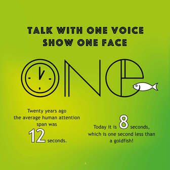
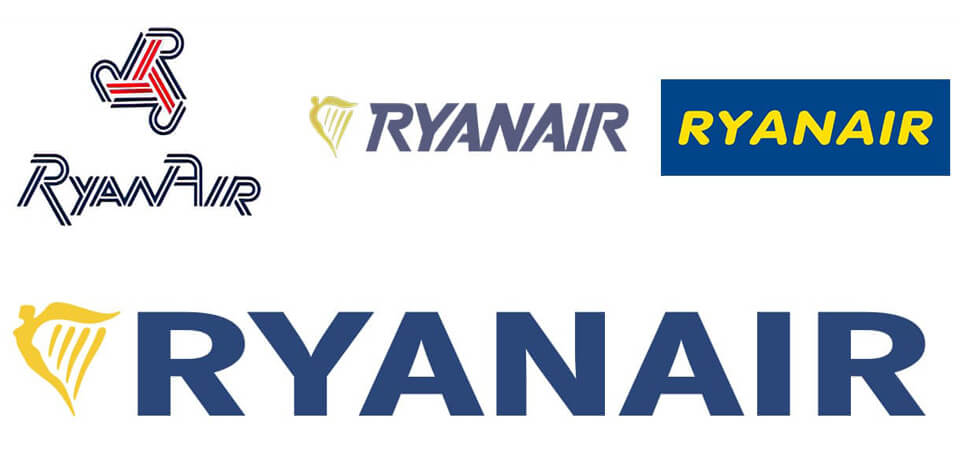
I went to see a Graduate Show last week, for students who have spent 3 years studying Visual Communication. It’s the same course that I did many moons ago. Well, the concept for the course is the same. It’s about visual communication. But the work looks totally different. What I learnt about logo designs way back then.... well it’s safe to say things have evolved. The number of media platforms consumed by people has increased so dramatically, it’s hard to imagine a life when marketing could only reach you via press ads, a couple of TV channels and outdoor posters. These days you’re bombarded with marketing from search to social media, streaming channels, influencers, blogs, gaming, e-commerce, on top of all the existing ‘traditional media’. We see ads everywhere we go, even at the beach. Here's hoping only skin cancer awareness campaigns will be allowed this... Not only is the media far more complex, our attention span is less than it was back then too if you believe the researchers at the Technical University of Denmark. Their study suggests the collective global attention span is narrowing due to the amount of information that is presented to the public. People now have more things to focus on, but often focus on things for short periods of time. Hence the importance of simplified logo designs. One reason for simplifying a logo is to make it more timeless and versatile. A logo that is too complex or trendy can quickly become dated and need to be redesigned. By making the logo more simple and clean, it ensures that it will remain relevant and recognisable for years to come. Another reason for simplifying a logo is to make it more memorable and recognisable. A simple logo is easier to reproduce and can be more easily scaled to different sizes and used across different mediums. This is especially important for global brands who operates in many countries and markets, such as Apple, Ryanair, Ikea. Their logos are great examples of logos that have evolved to stay relevant. And they will continue to do so, I'm sure, in response to new trends and new technologies. There might also be a greater emphasis on sustainability and ethical branding going forward. And perhaps empathy? With the excitement but also slight fear of AI, who knows what will happen. Empathy seems to be one of the few qualities that AI can not master...
 Customers look for ways to find what is relevant to them and ignore the rest. To be one of the brands that capture their attention, you need to make your company easily recognisable. Visuals speak louder than words, more so than ever before. Most brands are complex and it is my job to strip away the unnecessary and to draw out the essential. By doing this the result should be a meaningful brand identity design that will help grow your business. Focus on one powerful idea, well told and beautifully designed. Here’s my design principles. Unique Your logo must have the ability to stand out against the crowd and it should be easily recalled after just a glance. Keep it simple for easy recognition. Less is more. Memorable A few seconds is all it takes to make a first impression, but you need to make sure your logo makes a lasting impression as well. Relevant Your logo must represent you. It must be appropriate, tailored to your audience and easily identified with your industry. However, it must not become a “me too” version of any other similar business to yours. Versatile Your logo will be used in a number of ways and in multiple contexts and it has to be clear and effective at any size. Timeless Focus on your brand rather than what the latest trends are. You want your logo to be able to stand the test of time. Keep your branding human. People want to know that they are not buying from a faceless corporate entity. Google changes its masthead regularly to reflect anniversaries and world events. Some digital brands rely more on their uniquely designed typeface instead of their actual logo or branding icons. And Netflix changes their graphics depending on what user is watching. Your brand identity should communicate the things you do in an instance by conveying your brand’s message confidently and positively - and it should be simple in structure. The easier something is to understand, the more likely people will become engaged with what you are trying to communicate. People’s attention spans are short. If your brand doesn’t grab your target’s attention in a split second, they’ll move on. Visuals speak louder than words, more so than ever before.
Simplicity is a key design principle and the number one rule I have lived by since I heard it for the first time, while studying Visual Communication in Norway: KISS. Keep it simple. Stupid. It still makes as much sense to me know, if not even more so; the easier something is to understand, the more likely people will become engaged with what you are trying to communicate. Most brands are complex and it is my job as a graphic designer to strip away the unnecessary and to draw out the essential. By doing this the result should be a clear, focused and memorable logo design. I believe that your brand identity should be a visual summary of your business and your logo should communicate the things you do in an instance. An excellent logo is unique, memorable, appropriate, versatile and timeless, but most important of all is that it is simple in structure and that it conveys your brand’s message. KISS applies to all things design. In fact, the phrase (“keep it simple stupid”) is thought to have been coined by the late Kelly Johnson, who was the lead engineer at the Lockheed Skunk Works. They designed the S-71 Blackbird spy plane amongst other things... |
Browse the categories below to read about all things branding.
All
|
- About
-
Portfolio
- Wicklows Historic Gaol
- INDI and NNA
- ONMSD
- HSE
- NU
- Dún Laoghaire-Rahdown County Council
- PacSana
- Saint John of God
- Origina
- End of Life Ireland
- Yes Dynamic
- Park Pets
- Matt Jones
- TEDx
- Naturally Cordial
- Flanagan Kerins
- HSCPA
- Wilfield
- Mandals Advokatene
- Gourmet Chef
- Dalkey Tidy Town
- Tax Advice
- Association Innovation
- 360me
- McKeon Homes
- Clinical Leadership Competency Framework
- Blue Rock Environmental
- Testimonials
- Contact
- BLOG


