|
People’s attention spans are short. If your brand doesn’t grab your target’s attention in a split second, they’ll move on. Visuals speak louder than words, more so than ever before.
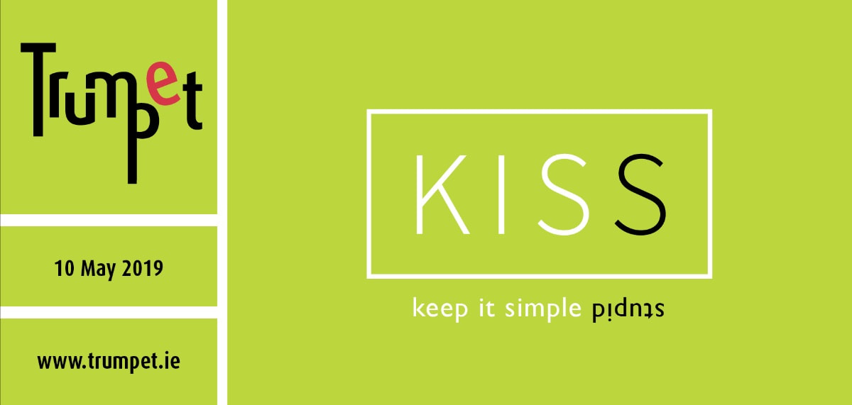
Simplicity is a key design principle and the number one rule I have lived by since I heard it for the first time, while studying Visual Communication in Norway: KISS. Keep it simple. Stupid. It still makes as much sense to me know, if not even more so; the easier something is to understand, the more likely people will become engaged with what you are trying to communicate. Most brands are complex and it is my job as a graphic designer to strip away the unnecessary and to draw out the essential. By doing this the result should be a clear, focused and memorable logo design. I believe that your brand identity should be a visual summary of your business and your logo should communicate the things you do in an instance. An excellent logo is unique, memorable, appropriate, versatile and timeless, but most important of all is that it is simple in structure and that it conveys your brand’s message. KISS applies to all things design. In fact, the phrase (“keep it simple stupid”) is thought to have been coined by the late Kelly Johnson, who was the lead engineer at the Lockheed Skunk Works. They designed the S-71 Blackbird spy plane amongst other things... Comments are closed.
|
Browse the categories below to read about all things branding.
All
|
- About
-
Portfolio
- Wicklows Historic Gaol
- INDI and NNA
- ONMSD
- HSE
- NU
- Dún Laoghaire-Rahdown County Council
- PacSana
- Saint John of God
- Origina
- End of Life Ireland
- Yes Dynamic
- Park Pets
- Matt Jones
- TEDx
- Naturally Cordial
- Flanagan Kerins
- HSCPA
- Wilfield
- Mandals Advokatene
- Gourmet Chef
- Dalkey Tidy Town
- Tax Advice
- Association Innovation
- 360me
- McKeon Homes
- Clinical Leadership Competency Framework
- Blue Rock Environmental
- Testimonials
- Contact
- BLOG

