|
Times change, consumer interests change, culture changes, businesses change, and your brand will at some stage have to change too.
If you look closely at logos for the likes of Coke or Google you will see that they keep refreshing their image. It might just be subtle tweaks but it happens surprisingly often. Old Spice didn’t change its logo, it changed the experience. To catch up with the changing market who found them rather stale (they have been around since 1937), they completed a full rebrand with new packaging, clever ads and smart use of social media. In only one short year following the rebrand, their sales increased by more than 100%. A successful rebranding involves overhauling a company’s goals, message and culture. Sometimes it involves changing a name. And most often it involves changing a logo. What does your brand need? Your brand identity looks old and outdated. If you have a well-established brand you need to do a proper audience research first. You might find people love your classic brand and a subtle tweak will do the job. Your business is looking to attract a new group of people. Your brand should always speak to the people you are trying to reach, and if your branding is not primed to help you connect with the target audience you are after, then rebranding can be the solution. Your brand has become too complicated. As a business grows it usually develops or acquire various products and services. A new business might start off as one thing, but over the course of time it could have transformed into something else. Transform this confused brand clutter into a unified brand. Your customers have started to look elsewhere. If your business has lost touch with what is important to your audience, rebranding might be what you need, to make it wanted and understood again. Your business is expanding internationally. Rebrand to adapt your brand to fit different languages if your brand name is not appealing to cultures worldwide. Your brand doesn’t fit the ‘online’ world. If your brand was developed before the ‘digital’ age you might need to simplify your logo and branding elements to make it work as well on screens as it does on printed materials. Your brand identity was done in a rush. Often newly established companies throw together a logo and some short-sighted branding elements just to get started. Sometimes it works. Most often it doesn’t. Your brand identity looks rather similar to your competitors. Your brand identity must represent your business and be easily identified with your industry but if it has become a “me too” version of your competitor, rebrand to claim your space again. Your business has merged or acquired. The way your business is perceived by those it serves should always align with the way it operates behind the scenes. People want to align themselves with brands whose values they share. When two independent brands come together it might need a rebrand to agree on the values they share. Your branding doesn’t accurately tell your brand story. Your branding should allow your customers to easily identify what your business is about. Does it? There are other reasons why businesses rebrand. New management who wants to make their mark, the need to cover up for bad press, or perhaps you’re simply bored of your own logo because you see it every day? Unless the whole business model is changed, do not consider it. People see through cover ups and nobody will ever see your logo as often as you do, regardless of how much you spend on promoting your business. Successful branding takes on average 2 to 3 years to become fully established, so stay true to your brand and give it chance to grow. 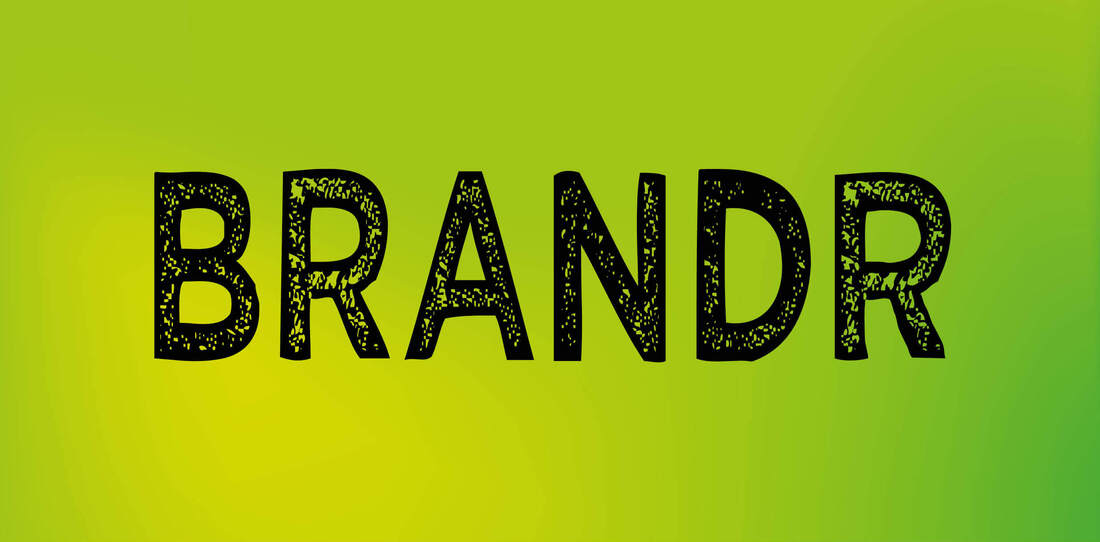 The word brand derives from the Old Norse word brandr and it means “to burn” or “to mark permanently with a hot iron.” Old Norse is an ancient North Germanic language from which my Norwegian language derived as well as the other Scandinavian languages.
Originally, branding was a method to mark ownership of cattle to try and avoid theft. Branding was used to differentiate one person’s cattle from another’s by means of a distinctive symbol burned into the animal’s skin with a hot branding iron. However, the practice of branding livestock goes back to the Stone Age. If you look at cave paintings from way back then you will see that it looks like they marked cattle with symbols drawn in paint and tar. About 4,000 years ago livestock owners switched to burning. At around this time brands were also used to identify various goods. Pottery makers from Greece, Rome, Mesopotamia (Iraq), China and India used engravings to identify where the ceramics were produced as well as who made them. And in Egypt, masons engraved symbols on the bricks they produced for the pyramids to distinguish their work from other masons. Many ancient civilisations, from Greece to China, used branding to sell their goods. As a way of explaining their offerings to people who could not read, the merchants hung up pictorial signs and they also painted their storefronts with symbols explaining their trade. In the 13th century, when trade was established between the east and west, the merchants made it mandatory to brand goods with proprietary marks in order to control trade. These trademarks also helped to assure the buyer of the quality of the merchandise. Papyrus was, for over 3000 years, the most important writing material in the ancient world. The Egyptians mixed vegetable gum, soot, ochre and bee wax to make the ink. However, what paved the way for different forms of branding was block-printing and paper, which were both invented in China some time during the Sung Dynasty (960-1279). This was the start of printed banners and printed advertisements, but it was the German businessman Johannes Gutenberg who invented the printing system that enabled mass production. This happened around 1450 and from then on printed information could be easily distributed and advertising became a popular and effective way to sell goods. The Industrial Revolution (which began in Great Britain in the mid 1700s and reached North America a few decades after) spurred the growth of branding. Petrol and coal powered energy paved the way for mass production. However, the selling of these products came off to a slow start as consumers were used to buying local products made in their own towns. There was trust in that, and generic products created ‘en masse’ didn’t have quite the same appeal. The solution for the product manufacturers was to copy what winemakers had been doing for some time already. They branded logos onto the barrels used to transport their goods. So the product manufacturers started to put their brand names onto their products and the brand identities they created represented human characteristics. This responded to the concerns of the public in trusting mass-produced products. It worked. More and more people were drawn away from commodities sold out of barrels to attractively packaged goods that promised “sealed freshness” and quality. Soon after, the product manufacturers began to mark individual products as well, as buyers were now able to choose from a wide selection of products for the very first time. By the late nineteenth century, companies had invested so much in branding that they needed a way to protect those investments from competitors. In 1875, they got it with the passing of the Trade Marks Registration Act. Now branding wasn’t just something companies did, it was something they could own. And that changed everything. At the beginning of the twentieth century, the western world prospered. More people than ever before could afford to spend money on branded goods, services and luxury items. As a lot of new brands entered the market and competition between brands was becoming more heightened, visual communication played a more and more important role in the success of their business. Corporations aimed to create professional images to represent their products. There was big business in targeting specific audiences by injecting a certain ‘look’, style and personality into specific products and companies. The Quaker Oats company replaced their trademark with the Quaker Man, and many popular brands like Coca-Cola and Campbell Soup followed. This began the modern practice of branding as we know it today. Shoppers were now buying the brand of a product. Branding evolved into a mark of quality and not only ownership. When Apple released the first Macintosh computer in 1984, they introduced it with a TV ad. This was a TV ad like no other. They got Ridley Scott to direct it and they showed it at the American Super Bowl where almost 50% of American households watched it. That was before internet and social media and we all know how the advertsing channels have changed since then. But their brand strategy is just as relevant today: It was about introducing Apple as a brand, not just a product. And the main focus was to communicate how they wanted their target audience to feel. The product itself, the wonderful Macintoch (that I purchased my first of in 1991) was only shown at the very end of the ad. Branding is still about taking ownership, and not just for property and products. It’s about owning what your company values and represents, owning up to your shortcomings, and earning customer trust and loyalty through your words, actions and stories. Today, the internet is involved in all aspects of advertising and marketing. Search engine optimisation has taken centre stage with the biggest advertising agency now being Google. Pessimists will say that the internet age has created a culture of instant gratification, leading to a generation of more and more demanding consumers. Sure, consumers have more information and more choices than ever now. But success is no longer determined by who has the biggest advertising budget or the most recognizable logo. It is determined by who makes the greatest emotional connections. And we can all do that. So go on. Tell your story. 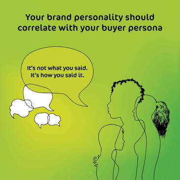 Consumers will most often decide if they like or dislike a brand based on the brand’s personality characteristics and the way the brand communicates. They are more likely to like and engage with a brand if they feel it is relatable to them in some way or another. Assess the personality of your business as if it were a person. Just as you may define a certain friend as ‘witty’ or a colleague as ‘enthusiastic’. What words would you use to describe your brand’s image? What attributes and/or emotions do you want associated with your brand and what do you not want associated with your brand? It often helps to combine what a brand is with what it is not. (Professional but not dry and corporate. Casual, but not lazy and messy.) One way of assessing this is by asking these questions: If the brand were to come alive as a person:
If you need some help to get going you might find Aaker’s “Big Five” personality traits useful. It’s a combination of varying traits that makes your brand unique. 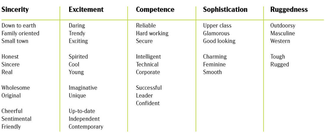 The written ‘personality’ of your brandThe words you use define how people perceive your business. Communicating with a consistent tone of voice builds trust, authority and likability. It adds an extra dimension of personality to your communications and helps to embody your brand’s values.
Finding your tone of voice starts with choosing the right language to reach your audience. It might be professional, casual, or even funny, but in order to establish an emotional connection that will lead to your audience trusting you and buying from you, you have to communicate in a way that they will believe. This is not to say that you should just go ahead and copy what has been done before in your sector. Not at all. Brands that break the rules are the ones that people remember. It may seem a risky strategy to find your own unique voice, but surely it’s not any riskier than being ignored? Vocabulary is simply a choice of words, so you must ascertain what type of words can and can not be used within your tone of voice so that your content embodies the ‘personality’ of the business. What kinds of words are definitely required and which words are forbidden? Keep it honest, consistent and accurate. When you feel you have nailed it, read your words out loud:
When you have found the right words you need to define a writing style. Keep in mind who you will be writing for. If it’s for other businesses, you may want to use a professional-yet-approachable tone, whereas if you’re writing directly to a customer you may desire a fun-and-exciting voice. One way to go about it is to emulate an existing publication. What does your audience read? The Financial Times? The Sun? Novels? Use a spectrum to get an idea of where you want to sit. From humorous to serious, formal to casual, or inspirational to straightforward. 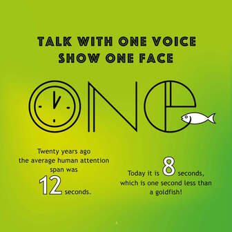 Customers look for ways to find what is relevant to them and ignore the rest. To be one of the brands that capture their attention, you need to make your company easily recognisable. Visuals speak louder than words, more so than ever before.
Most brands are complex and it is my job to strip away the unnecessary and to draw out the essential. By doing this the result should be a meaningful brand identity design that will help grow your business. Focus on one powerful idea, well told and beautifully designed. Here’s my design principles. Unique Your logo must have the ability to stand out against the crowd and it should be easily recalled after just a glance. Keep it simple for easy recognition. Less is more. Memorable A few seconds is all it takes to make a first impression, but you need to make sure your logo makes a lasting impression as well. Relevant Your logo must represent you. It must be appropriate, tailored to your audience and easily identified with your industry. However, it must not become a “me too” version of any other similar business to yours. Versatile Your logo will be used in a number of ways and in multiple contexts and it has to be clear and effective at any size. Timeless Focus on your brand rather than what the latest trends are. You want your logo to be able to stand the test of time. Keep your branding human. People want to know that they are not buying from a faceless corporate entity. Google changes its masthead regularly to reflect anniversaries and world events. Some digital brands rely more on their uniquely designed typeface instead of their actual logo or branding icons. And Netflix changes their graphics depending on what user is watching. Your brand identity should communicate the things you do in an instance by conveying your brand’s message confidently and positively - and it should be simple in structure. The easier something is to understand, the more likely people will become engaged with what you are trying to communicate.  Winston Churchill, Albert Einstein and Salvador Dali were all great believers in the power nap. And so am I;-)
A mid-afternoon nap of just 10 to 20 minutes will improve your alertness, creativity and performance. Anything longer, might “enslave” you with laziness for the rest of the afternoon. (Salvador Dali’s words, not mine.) Because of the natural cycles of our circadian rhythms, we are at our most tired twice during a 24-hour period. For most of us the peak of sleepiness is in the middle of the night and in the middle of the afternoon. In other words, the dreaded mid-afternoon slump is part of human nature! So rather than fighting it off with tea, coke or coffee, try a short nap to refresh your brain before taking on the afternoon. How to Nap? Things you can do to relax: Turn off your phone. Set an alarm for half an hour so that that you know you won’t fall asleep for hours. Set your napping space up with as little light as possible and use ear plugs to help tune out disruptions. Keep warm with a blanket. If you have the time you can try to read something relaxing (or boring!) for 10 minutes first. I am still new at this and I do not manage to nod off as often as I’d like, depsite following the above tricks. It doesn’t really matter too much though, as the short break gives me energy regardless. Practise is key. Figuring out what works for you can take a while. Try to experiment with different times of the day and different nap lengths. Napping at Work Winston Churchill would take a two-hour nap every day at 5 p.m. He said this allowed him to get 1 1/2 days’ worth of work done every 24 hours. Google, Mercedes-Benz and NASA are all companies that believe in the power of napping. As the Vice President of Google, David Radcliffe says: No workplace is complete without a nap pod. That nap pod can be any space, really. If you’re self-employed you can use your sofa, as I do. A parked car or the office loo are both nap pods that friends of mine swear by. And if your boss is not too happy about it? Well, if he or she needs to know you can always show this blog with my convincing argument that you work more efficiently afterwards! Good luck and thanks for reading. The purpose of brand guidelines is to create a distinct and unified presence for your brand6/8/2019
 Brand identity are communication components related to your business, product or service. Every brand, from the smallest startup to a corporate giant, need a set of branding guidelines to maintain their identity. This is a toolkit containing specifications on everything that plays a role in the look and feel of your brand. Everything from variations of the logo and how it can be used, to what typefaces, colours, images and tone of voice to use.
It lets everyone know exactly how to present your brand to the world. There are some brand style guides that are over 100 pages, and some that are as short as one single sheet. Here’s a list of what I think a substantial Brand Identity Guideline document should include:
Use brand guidelines to ensure that all your brand assets always provide a consistent message that is true to your values. The biggest enemy of branding is often when the internal team starts to meddle with the logo. Hence the importantance of including what not to do with your branding elements in your branding guidelines, as well as what to do. Developing all the necessary brand assets your business needs happens over time. Approved templates ensure that nobody needs to reinvent the wheel every time they create content. Consistent branding leads to recognition and credibility. Consistency also signals predictability. Customers believe that when they buy a certain brand, it will perform as they expect it to. Pay careful attention to brand consistency, and you will be rewarded.  People’s attention spans are short. If your brand doesn’t grab your target’s attention in a split second, they’ll move on. Visuals speak louder than words, more so than ever before.
Simplicity is a key design principle and the number one rule I have lived by since I heard it for the first time, while studying Visual Communication in Norway: KISS. Keep it simple. Stupid. It still makes as much sense to me know, if not even more so; the easier something is to understand, the more likely people will become engaged with what you are trying to communicate. Most brands are complex and it is my job as a graphic designer to strip away the unnecessary and to draw out the essential. By doing this the result should be a clear, focused and memorable logo design. I believe that your brand identity should be a visual summary of your business and your logo should communicate the things you do in an instance. An excellent logo is unique, memorable, appropriate, versatile and timeless, but most important of all is that it is simple in structure and that it conveys your brand’s message. KISS applies to all things design. In fact, the phrase (“keep it simple stupid”) is thought to have been coined by the late Kelly Johnson, who was the lead engineer at the Lockheed Skunk Works. They designed the S-71 Blackbird spy plane amongst other things... 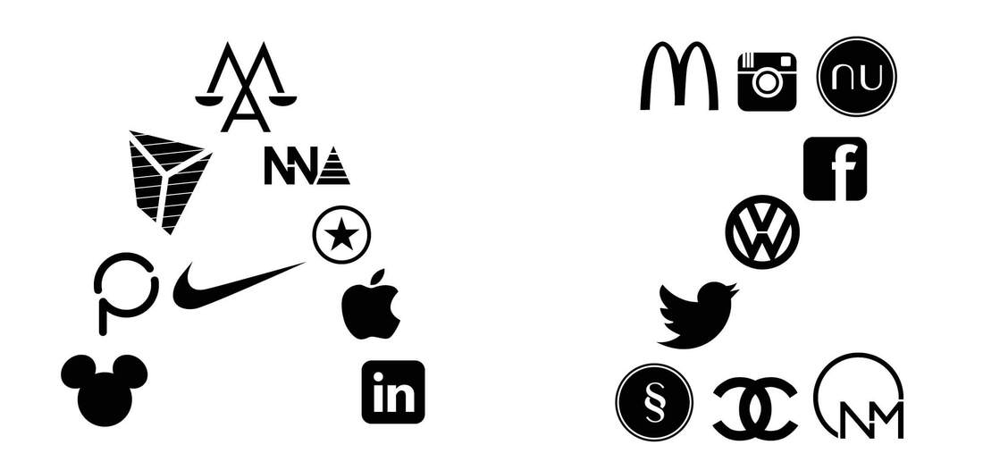 Naming your business is the most challenging process of branding. Millions of names have already been registered by hundreds of thousands of businesses across the globe so finding, generating, choosing and purchasing the ‘right’ name is difficult. Very difficult. But it is critical.
The sound and feel of your business name should suggest what your business is all about. It should reflect the character of your business. How do you want people to feel when they read or hear this name for the first time? Your business name needs to be unique and memorable and it should be easy to say. The shorter, the better. You should also make sure that the name doesn’t translate into something inappropriate in a different language. There’s plenty of ways to go about developing a name for your business. Here’s 10 ideas and some successful examples. Use the founder’s name Hewlett-Packard (David Packard and William Redington Hewlett), Marks & Spencer (Michael Marks and Thomas Spencer), Boots (John Boot) and IKEA are a few examples. Ikea is named after the initials of its founder, Ingvar Kamprad, the farm where he grew up called Elmtaryd and Agunnaryd, the nearby village. Describe what it does Create a name that describes what the business does. Microsoft’s Internet Explorer is a perfect example of a descriptive name. Consumers use it to explore the Internet. Describe what it is Mark Zuckerberg originally wrote Facebook as a social network for the student community in Harvard where he himself was studying at the time. A face book is a printed or online directory found at American universities consisting of individuals’ photographs and names, helping students get to know each other. Make an acronym Richard Saul Wurman created TED to inspire greater communication between 3 industries: Technology, entertainment, and design. Make up a word The name Google came about by accident. Whilst trying to think up a name related to the indexing of an immense amount of data the words “googolplex,” and “googol” were suggested. Both words refer to specific large numbers. When they did a search of the domain name registry to see if Googol.com was still available they made the mistake of searching for the name spelled as “google.com ” instead. Pick a geographic origin Jeff Preston Bezos, the founder of Amazon.com, picked up a dictionary and scanned word after word until he discovered the word “Amazon”. He liked this name for two reasons. In the past, websites were listed alphabetically, which meant Amazon would always be higher on the page, giving a slight competitive advantage. And secondly, he picked the largest river in the world to communicate Amazon’s vast selection of books. Add a Prefix or Suffix You can turn a common word into a product name simply by adding a prefix or suffix to it. An example is Apple’s iPhone, iPad and iMac. BMW 2, 5, 7 series and Audi 2, 3, 4 and 6 series are examples of similar ‘naming systems’. Change Spellings Flickr and Liquid-Plumr use real words that are misspelled. It’s creative and helps when the name you want is already trademarked or the related domain names are already taken. Take a word out of context The name Matrix Electronics didn’t cut it. Apple Computer was named so after Steve Jobs’ visit to a commune he called an ‘apple orchard. Siri was also named by an Apple employee. Dag Kittalaus, the Norwegian co-creator of the voice-activated assistant had actually planned to name his daughter Siri, which means “beautiful woman who leads you to victory” in Norwegian. Until he had a son. Use a Verb You can use a verb as your product name, like Bounce dryer sheets or Apple’s iPod Shuffle. Some examples of brand names that have turned in to generic verbs are Skype, Hoover, Photoshop, Tipp-Ex and Google. 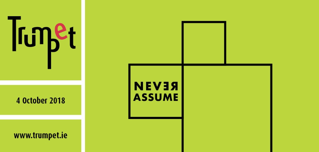 When I moved to Dublin twenty years ago I had a pretty good understanding of the English language. Or so I thought. I hadn’t a clue about the different meanings between American English and British English and this has caused quite a few misunderstandings over the years...
But a shared language does not actually mean everyone has the same understanding of all words. We are all different people, and there are different nuances as to how we think. We might have a different understanding of a common word or our understanding of the connotations of words might differ. Often people’s understandings of words are close enough that, for many purposes the differences are fine and nothing to worry about. However, sometimes the differences are relevant and this causes misunderstandings. And many of these misunderstandings go unnoticed because people think they agree, and never discuss further to find out if they really do agree, or not. See? Communication is challenging. Never assume communication is automatic. Some people communicate brilliantly over the phone but mess it all up when writing an e-mail. It could be the smallest comma that makes all the difference, like in these two examples below: We order merchandise and sell the products. We order, merchandise and sell the products. A woman, without her man, is nothing. A woman, without her, man is nothing. Others are the other way around, the written words come easier than making conversation. When I say something, you have to guess what I mean. Take the time to listen and ask the following questions: What am I saying? What do you think that I am saying? What can you hear? What do you think you hear? What is actually being said? Do whatever you can to make the concepts in your head translate into something the other person can understand. Write it out, draw sketches, talk through it or give examples. Managing expectations is a big part of my job as a graphic designer and that is what effective communication does. But the ability to communicate is crucial for everyone, in all parts of life, not just your working life. If you just remember that the best way to avoid any misunderstandings is to never assume, well then you are communicating well. Thanks for reading.  While logos are visual representations of a brand, taglines are audible representations of a brand. If your business name is not already descriptive of what you do, well then your tagline should be. A tagline starts with the values and truths that make your business what it is, it makes your business’ benefits clear to the target audience. Descriptive, inspirational or humorous, the best taglines are both a mission and an outcome. List all your business features and describe every single benefit in great detail. Write down any random words that comes to mind, including the negative ones. Let Thesaurus help you if you get a bit stuck. The more words, the better, even if they don’t sound right at all. What do people say about your business, product or service? List everything, being it positive or negative. The next step is to create short phrases from all these random words. Try not to be too clever. The best taglines use very simple words combined in a way that makes you remember them. A great example is Ronseal’s tagline: Does exactly what it says on the tin. Here’s a few more: The National Lottery: It could be you. Nike: Just do it. Apple: Think different. L’Oréal: Because you’re worth it. Tesco: Every little helps. Nokia: Connecting people. KFC: Finger lickin’ good. Kit Kat: Have a break. Have a Kit Kat. Pringles: Once you pop, you can’t stop. Carlsberg: Probably the best lager in the world. Interflora: Say it with flowers. Gillette: The best a man can get. Audi: Vorsprung durch technik. (Advancement Through Technology.) Avis: We try harder. Think clear communication and remember to be truthful. |
- About
-
Portfolio
- Wicklows Historic Gaol
- INDI and NNA
- ONMSD
- HSE
- NU
- Dún Laoghaire-Rahdown County Council
- PacSana
- Saint John of God
- Origina
- End of Life Ireland
- Yes Dynamic
- Park Pets
- Matt Jones
- TEDx
- Naturally Cordial
- Flanagan Kerins
- HSCPA
- Wilfield
- Mandals Advokatene
- Gourmet Chef
- Dalkey Tidy Town
- Tax Advice
- Association Innovation
- 360me
- McKeon Homes
- Clinical Leadership Competency Framework
- Blue Rock Environmental
- Testimonials
- Contact
- BLOG